Wavelength · 2025
A calmer way to listen
A music app that recommends less, so the music you do find actually stays with you.
- Role
- Lead Designer
- Timeline
- Jun – Nov 2025
- Team
- Me, 2 engineers, 1 researcher
- Platform
- iOS & Android
The problem
Streaming apps optimize for more — more rows, more mixes, more autoplay. Wavelength's founders believed the endless feed was why nothing stuck: when everything plays, nothing matters. They wanted an app for people who miss the feeling of wearing an album out.
The approach
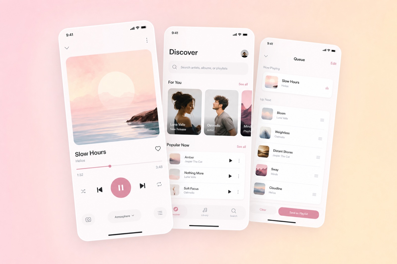
We designed around scarcity. Discovery became a weekly ritual of just seven recommendations, presented one at a time with room to breathe — cover art at full width, one paragraph on why this record, no skip-to-next reflex. The now-playing screen dropped every social feature and kept lyrics, credits, and a single queue.
Restraint like that only works if the surfaces feel considered, so we spent most of the visual budget on typography and motion: soft transitions between screens, album palettes tinting the player, nothing bouncing for attention.
What shipped
Listeners finished albums 2.4× more often than on their previous app, and the weekly seven became the product's identity. The lesson I keep from this one: a feature you remove is a decision you get to design.